Apr 24, 2019

Book Look (A Whole Book Approach Storytime): Gutters


This week was our final Book Look Storytime and we were examining gutters.  Just in case you don't know already, gutters are the crease at the center of the book, where the binding comes together.  All of the books above make interesting and effective use of the gutters.  Let me show you a few examples:

In Jon Agee's new book, The wall in the middle of the book, a gutter becomes a brick wall that literally divides one side of the book from the other.  There's some question about which side is the "safe" side and in this spread, the ogre manages to reach OVER the wall by escaping the confines of the pages themselves:
 The group pointed out that the cover of the book is a great preview for the story but from a different perspective.  (Note the creeping water in the bottom left corner...)
 The gutter in Chris Raschka's classic Yo! Yes? divides two characters, isolating them, until they realize that they can be friends with each other and then the get together on the same side of the book.  We also talked about the subtle background color changes in this book and how they reflect the mood of the characters.

 Suzy Lee's book, Shadow is an amazing and unique example of gutter use and this mostly wordless text brought lots of emotional responses from listeners.
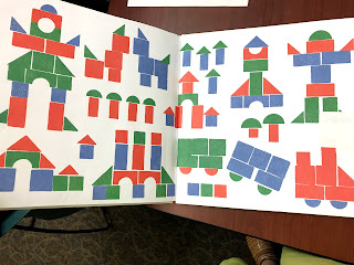
 In the book Blocks by Irene Dickson, Ruby and Benji are playing separately with their red and blue blocks, safely divided by the gutter.  Until this page:
 Look at all the action happening right across that gutter!  I asked the kids what they noticed and they said, "lots of movement!" one kid thought that the little black lines were hairs flying all over the place, but another child informed us that they were wiggle lines.

When they reconcile their differences and build something together, the apex of their structure is... right over the gutter!
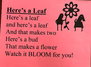
Our fingerplay today was:

Two tall telephone poles, (pointer fingers up!)
Between them a wire is strung. (tips of middle fingers touch each other)
Two little birds hopped onto the wire (thumbs are the birds)
And they swung, swung, swung. (swing it back and forth)


We did the app OLO Game because the action in that game is all about crossing the gutter!

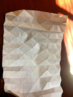
 Today's art invitation was to fold the paper and make use of the gutter in your art.  Here are a few examples:


All in all, this has been a really interesting series, but not well-suited for the three-and-under crowd. While I will likely still pull in some of these techniques for one or maybe two books during my regular preschool storytime programming, doing an entire storytime based on this approach lost a few of the more active younger kiddos and some of the older kids got impatient and begged me to "just read the story!" But I love asking kids what they notice because it's often a revelation to me and I even loved letting them choose which book I read from a selection of titles standing up on a table.  It's as close as I can get to a "self-determined storytime"!


Apr 18, 2019

Book Look: A Whole Book Approach storytime, week 3 (Amazing Endpapers!!)

I could talk about endpapers... endlessly!  It's one of the first book design elements I started noticing and calling kids attention to looooong before I read Megan Dowd Lambert's Reading Picture Books with Children book, so I was excited last week when one of the kiddos said, "I'm tired of talking about the size and shape of the book, can we talk about something else?  Like endpapers or something?"

First, I consulted Lambert's fantastic round-up of book titles with exceptionally interesting endpapers and through that I discovered Ruzzio's This is not a picture book. The difference between the endpapers at the beginning and end of this book is subtle but SO, SOOOO significant! 

The kids also noticed how the background of the pages is utterly blank until the duckling begins to read and then... the world becomes full of color and detail. So many great design details here in the illustrations and endpapers--just check it out for yourself!

The first book we actually read together was Sam and Dave Dig a Hole by Jon Klassen and Mac Barnett. I LOVE how the subtle endpapers tie in to the story (hint, check out the trees).  The kids loved how the endpapers matched my outfit today!

We didn't even READ Britta Teckentrup's book, Neon Leon but the endpapers tell the whole story in just a few simple shapes:

And the kids DID insist that I read Nanette's Baguette by Mo Willems but I think that was because they wanted to hear me struggle with all of the tight rhyming, whew!

We also did a little finger play:
And I gave a sneak peek into one of next week's books: Blocks by Irene Dickson by just comparing the beginning and ending endpapers:

And we ended with an exploration of The Very Hungry Caterpillar: Creative Play app (it allows users to cut virtual shapes out of full "sheets" of Eric Carle's great painted textures that he uses for collage in his own books!):

What are your favorite endpapers?


Apr 17, 2019

Book Look: A Whole Book Approach Storytime (week 2, Orientation + a little Gutter talk)

This week, we compared books that were Landscape and books that were Portrait in orientation and talked about why that might be.

We started off with a little action rhyme:
And then I started off with a close comparative reading of I want my hat back and This is not my hat by Jon Klassen. I love reading these two books together and comparing/contrasting them!  The kids all agreed that the bear book was in portrait orientation because the bear stand up and is tall while the fish book is landscape because of the shape of the fish, but we talked about LOTS of other things as well!

Then we moved on to reading Building with Dad by Carol Nevius, illustrated by Bill Thompson which has such great perspectives in the illustrations!  The spine is on the TOP of the book (I'm sure there's an official binding or book design term for that, but I don't know what it is!) so that when you open the book it appears even TALLER than the cover image.  The kids pointed out that although many of the images are from down low, looking up high, there are a few where we are up high, looking down to the ground.  We also talked about the shifting horizon line and how it might help dictate how we should hold the book on each page.  (sorry, I've already sent my copy of the book along to another storytime, so you'll just have to find your own copy of the book to examine, but it is WORTH it.  One of my favorite "construction" books!)

Next, the kids chose to read the book Wave by Suzy Lee.  Although the horizontal pull of the wave and the width of the beach make the portait landscape an easy choice, we ended up talking a lot about the gutters in this book!  How at first, the gutter clearly divides the water from the girl and the birds:
and a few pages later, the girl and the birds cross over the gutter to join the water:

 and then how the mountains fade to nothing because the only thing interesting is playing with water:
 And then when the girl and the birds cross back over the gutter to get away from the water:
 And of course, when the water finally crosses the gutter in this magnificent fashion, getting EVERYTHING wet...

I used, "Oh! The Magic Drawing App" as our app of the day because it does a PERFECT job of demonstrating the difference between portrait and landscape, plus it's a book app (a companion app to the book "That's my hat!") and it's free!

At this halfway point, I feel like this storytime would be EXCELLENT for school-age kids, but is stretching the preschoolers pretty far.  Most of my responses are from a homeschool family that attends and a few of the parents making keen observations as well. But if you've got a regular program that combines books and school age kids... I think this would be a hit!

Next week we'll be looking at endpapers by special request of one of the kiddos!  (I LOVE endpapers...)


Apr 16, 2019

Book Look: A Whole Book Approach storytime (Week 1, Trim Size)

I'm trying a storytime experiment!  I was so inspired by Megan Dowd Lambert's book Reading Picture Books With Children about the Whole Book Approach that I've been trying to weave elements of it into my regular preschool storytime ever since reading it a few years ago.

Recently, I've been thinking about ways to make my storytimes more... child-led (a la Anji Play) and I keep coming back to this Whole Book Approach concept.  Basically, instead of just blasting through a book to figure out the ending as quickly as you can, you instead ask really open-ended questions like, "What do you see?" or "Why do you think the book designer made that choice?" -- questions that (preferably) you DON'T have a specific answer in mind for -- and see what the kids come up with. I'm doing an experiment this year for the month of April and trying to do a whole storytime based on this approach. 

The first week, we looked at "trim size" or really big books and really small books.  The photo above shows some of the books I had on the table for them to choose from.  We actually explored Madeleine, Pierre and Leonardo and then did the Going to Bed book as our app of the week.  We talked about why the authors/illustrators chose to make these books big or tiny and the kids had some good ideas.  But some of the BEST observations were ones they made that had nothing to do with the size of the book.  For instance...


In Madeleine, we noticed that some of the illustrations are only yellow and black while others are more full-color and one of the kids pointed out that the yellow illustrations (at least for the first half of the book) are all interior pictures and the full color ones take place outside the school (this theory doesn't hold strictly true throughout the book but close enough to be very interesting!).


In Leonardo the Terrible Monster, they pointed out the symmetry of two 2-page spreads--one which features a sad Leonardo in the bottom right corner and the other which features a sad Sam in the bottom left corner.  Both pages have almost no words, but the words that ARE there are a simple introduction to the character.


Next week we'll be discussing Orientation (Portrait vs. Landscape) -- can't wait!
Template developed by Confluent Forms LLC; more resources at BlogXpertise